ANGLR Labs


Helping anglers plan, record and improve their time on the water.

The Challenge


ANGLR Labs is a startup located in Pittsburgh, PA that is trying to disrupt the fishing industry. When they approached us for help they already had a web and mobile application in the wild. With the momentum of their Bluetooth accessory which allows anglers to log catches with real time weather and water conditions, they quickly realized their mobile and web products needed to be revisited. While the products offered insightful data and powerful features, users were having a difficult time trying to navigate the application and make sense of all the data at hand. The challenges at hand:

01.

Intuitive Navigation

With real time data analytics, multiple map layers and options for any angler - navigation and information architecture became a burdensome. The core functionality and advanced features/options needed to remain consitent and intuitive for all users.

02.

Cognitve Load

Because of the amount of data that was being captured to help anglers improve, in some interfaces there was just too much for a user to consume and became confusing.

03.

Consistent Patterns

Menus, primary and secondary actions were sometimes inconsistent in areas of the applications resulting in unexpected behaviors.

Services


Research & Strategy

  • Product Strategy
  • Product Research
  • User Personas

Design

  • Wireframes
  • Product Design
  • Mobile Design
  • Web Design

The Solution


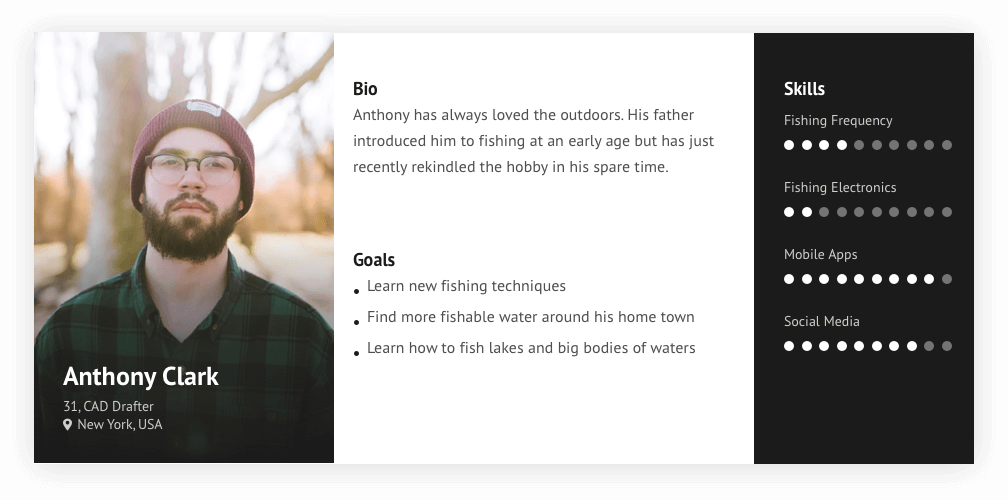
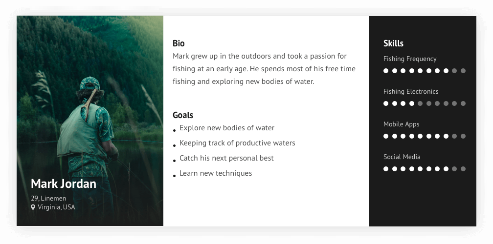
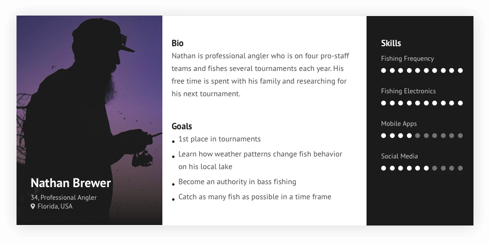
The first step in helping ANGLR was to determine who their users where, what they are after, and how they could help them improve. Fishing in general is a vast landscape. From oceans to ponds, every detail associated with “fishing” can be different. In addition to that, each angler has their own diverse background and preferences. To help establish a generalized audience, we created user personas that capture the three major groups of fishermen.

Where it all starts


At the core, ANGLR’s most valuable feature is it’s FishMode. An angler can use FishMode to record his/her time on the water to help them better understand and develop patterns of their time spent fishing. With the ability to log catches and mark waypoints, this allows an angler to create a in-depth “log” of each trip. Each trip and catch automatically grabs real time data for weather and water conditions. Once a trip is complete a user can view this data in a trip summary to help them understand what patterns and conditions help make a day on the water epic!
Mobile App Design

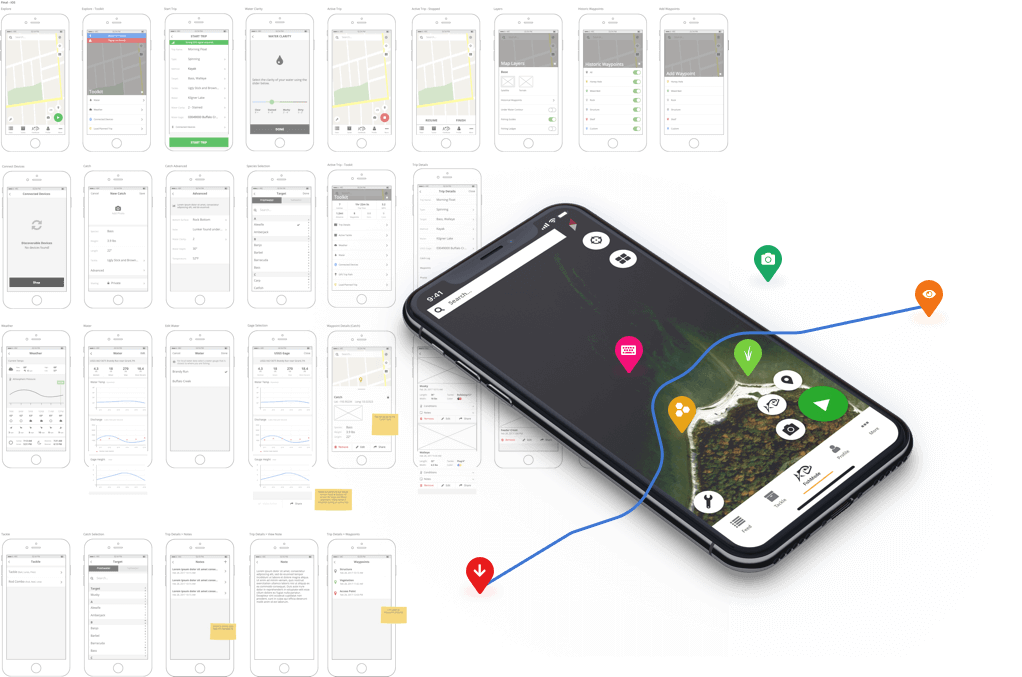
One of the largest efforts was redefining the FishMode experience for ANGLR. This was the core functionality of the app and was the point of entry that defines a users journey with ANGLR. The first and foremost principle instilled was to spend less time on a mobile device and more time fishing. Reducing the amount of information on the screen helped anglers focus on what was required for recording their trips. For the professional and data oriented anglers, advanced features are available via secondary actions, but for the vast majority of users it is as simple as tapping a start button to start a trip.

To quickly get the redefined experience into the wild, we created a mix between lo-fidelity and high fidelity screens for the team to develop. This helped the development side move forward while product was defining new features.
Consistency from the water to desktop


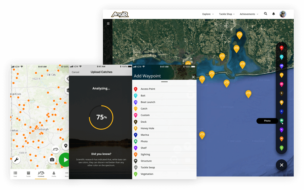
ANGLR provides both mobile and web applications for the angler. The desktop experience provides a way for an angler to review and learn more about their trips on the water. All trips are synced to the web and provide a way to view trips, reports and the ability to replay their fishing trips.

Part of our effort with ANGLR was to ensure patterns and behaviors were consistent across both platforms. The mobile applications provided ‘FishMode’ to anglers to record their trips. Prior to starting a trip they could still explore and drop waypoints of potential fishing spots. On web, Explore provides the same concept. In addition to that, users can toggle on historic waypoints and trips they have completed.

We ensured navigational patterns, such as editing a trip or catch, followed the same patterns as the mobile app did. These consistencies helped to alleviate user confusion and more data-rich trips and catches for the angler.

Mobile App Design

Our involvement with ANGLR has been a long term engagement as an extension of their core team. The issues which impacted their application was creating a poor experience resulting in confusion and frustration for the end user. The cognitive load was very high for many areas resulting in drop outs or incomplete tasks. Inconsistent patterns between mobile and web caused confusion and headaches for users looking to dive into their details after their day on the water. By addressing these issues, the experience for their applications improved dramatically. The end result is that they've gained users and received higher app store ratings. The owners of ANGLR could not be more thrilled.

Their involvement feels more of an extension of our internal team than a contracted resource. ANTLR is fast, responsive, and challenge in areas of expertise to make for the best ultimate outcome in products. Highly recommend!

Nic Wilson

ANGLR Labs

Let's build something great


Interested in working with us? Let us know or just say hi.